
|
| weblog/wEssays archives | home | |
|
Another Chart for Predicting the Bottom in Housing (April 4, 2006)  Yesterday we looked at trendlines as a way of predicting post-bubble housing prices.
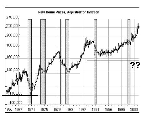
Here's another method. As you can see in this chart, once adjusted for inflation,
housing prices tend to act much like stock prices--an initial rise reverts to the
starting point before pushing to a new high, which then recedes to a new support level.
Since housing established a new base in the early 90s, it would seem plausible that post-bubble, it would return to a level between $160,000 and $180,000 before starting another leg up. This chart supports the view that housing appreciates (adjusted for inflation) about $20,000 each decade. This would suggest that the price of a new home will drop from the recent median peak price of $244,000 back down to around $180,000. Yesterday's calculations suggested a 30% decline in overall housing prices was plausible; a 30% decline from $244,000 would indicate a post-bubble new-home price of about $170,000. If history echoes (rather than repeats), and housing appreciates $20,000 in the decade 1990 - 2000, then this bubble will likely revert to the $180,000 level. Based on this chart, we can conclude that if history is any guide at all, the price of a new home will decline from its bubble peak of $244,000 down to about $170- $180,000. Anyone interested in bubbles (in tulips, real estate, commodities, stocks, you name it) will benefit from reading Irrational Exuberance For more on this subject and a wide array of other topics, please visit my weblog. copyright © 2006 Charles Hugh Smith. All rights reserved in all media. I would be honored if you linked this wEssay to your site, or printed a copy for your own use. |
||
| weblog/wEssays | home |